
Websites i don't like:
- Craigslist
- U2
1. Pages are cluttered
 (2).jpg)
2. Easy access to different pages
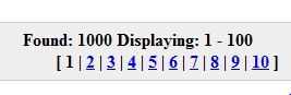
3. Search tab makes it easy to navigate.
.jpg)
4. The text is so small
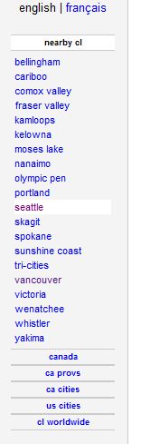
Craigslist is the website that everyone likes to visit. The target audience for this website could be age group (15-60). Most of the people don't like the lay out of the website but still visit it because the content is useful. The use of tiny text could be an issue for elderly people. I like how they have option for both languages english and francais. This makes it even easier to navigate. The navigation is pretty obvious but hyper links are internal for that the user may have to go back again and again. Since this website is used more frequently even if you don't have the URL to actual site you can search it up in any search engine by just typing Craigslist. Even though it has unattractive visual appeal, it's content is enough to satisfy the user. I would rate this website ★ ★ ★ because it could be done more effectively by using different color contrast, font size and external hyperlinks.