
"u2"
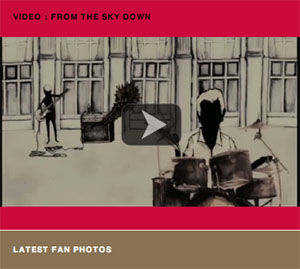
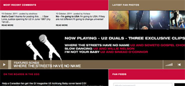
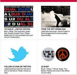
u2 duals is a band and u2 is their website. Target audience for the website can be people age group (15-35). I love this band and their music but i hate how they created their website. There are a lot of things that i would wanna change in this website. I only like the color contrast because it is captivating. Website takes time to load because of excessive use of media on the home page. Home page is too cluttered and different images are all over the page without any specific tab. Photo selection does not go with the main purpose of the website. Fan feeds tab is on the home page which makes the page look disorganized. Website content is limited and hard to navigate because the data is not organized into specific categories. Even though there selection of videos is very unique but they have not use it effectively. i would rate this website ★ ★ because there are so many ways to make this website better looking and easy to navigate.